Data wrangling with graph theory
Data wrangling with graph theory
24 January, 2025 •As a Data Scientist, most of my time is spent wrangling data – dealing with inconsistent formatting, unstandardised data collection and unclear documentation (if documentation even exists). The frustration can be immense, that is, until you find a solution to your puzzle.
Cenfri’s work in the Rwanda Economy Digitalisation Programme focuses on data-driven decision-making. Cenfri has partnered with the Rwandan Ministry of ICT and Innovation and the Mastercard Foundation to access strategic datasets and provide analysis to support policymakers and private businesses. We work with various stakeholders – mainly in the financial, education, agriculture, transport and tourism sectors – and have made great strides in demonstrating the value of data and the insights it can generate.
The problem
A client had data and they wanted us to analyse the data for trends and then display the results of the analysis in a dashboard. The clients bought goods, which they processed, stored and sold. I wanted to show the profit they were making on sales (sell price – purchase price) but this turned out to be a bit tricky. Their database was a set of manually maintained spreadsheets, resulting in data consistency and quality issues.
What was happening was that, when goods were purchased and stored, a record was written out with the quantity and purchase price, let us say 50 units at $100 per unit. Then, when someone wanted to purchase from them, let us say 25 units, the original record would be split in two, each of 25 units, and these two new records would be entered into the spreadsheet and one marked as sold with its sell price. The client would keep track of which record the two new ones were split from, but they did not include the original purchase price in the new records. You could manually go through the thousands of records and piece together the puzzle, but there had to be a way to automate the process.
A brief description of the data is given below and can be found [here]
- “from_record” is any parent node that may have been split into other records. Two records can also be combined into one.
- “from_units” is the number of goods associated with a record.
- “purchase_date” is the date the goods were purchased – this is only available for original records.
- “to_record” is a child record that was produced from the parent, for original nodes to_record is the same as from_record.
- “to_units” the weight of the resulting records from a split or combination of records.
- “sell_date” is when a record was sold.
- “purchase_price” is the amount paid per unit, which is null for all but the originating records.
- “sell_price” is the price goods were sold at, which is null where the record has not been sold yet or was split into further records.
Why a SQL solution would not work
I’m most confident using SQL, so I always start with loading data into a dataframe or some relational structure. My initial thought was to do a self-join of the table by linking ‘from_record’ and ‘to_record’ columns to determine a record’s purchase prices. A single SQL query solution would only work if records were split a consistent number of times because then you would know how many times to join the table on itself (number of joins = number of splits – 1). Unfortunately, the data was not structured like that and was, in some cases, split up to 30 times.
And what about when records are combined and then sold? As much as I enjoy a good SQL puzzle, there had to be a simpler way than trying to write dynamic queries to account for the number of splits and combinations. So instead of going down that potentially long and winding road, I explored using graph theory as an alternative.
Graph theory
Graph theory originated in 1736 with the Seven Bridges of Konigsberg problem published by Leonhard Euler. He was trying to figure out if he could go for a walk in the city of Konigsberg while crossing all seven bridges only once. He formulated the problem with each bridge being an edge and each section of land being a node. Centuries later this idea had been expanded and further developed, and along with advances in computing power, Google’s Larry Page developed the PageRank algorithm used to power their search engine.
The applications of graph theory are wide, including computer science, linguistics, physics, social sciences, biology, mathematics and possibly data wrangling. I have, for some time, been interested in graph data structures with the different calculations and algorithms you can run but have not come across a viable use case in my work. Since the data lends itself to a network, I decided to explore some ways to leverage graph properties and algorithms to solve the problem.
If we think about each record in our data as a node and the splits/combines as edges, then we should be able to map the ‘network’ of records. Each component of the graph would be its own sub-network with one (or many) origination nodes where we have the purchase price. Subsequent nodes would be those that were sold (and have a sell price) or intermediary records that were further split into records that were then sold.
The first task is to get the data into a format that would allow us to generate a network structure. This means making sure that we have the record IDs, the purchase price of the original record, the sell price and quantity if it was sold, and most importantly – the record IDs of the parent records for records that were created by splitting or combining parent records. This parent ID, or ‘from_record in our data, ensures that we can link records and generate a graph.
Using graph properties to solve the problem
I used R for the analysis with the igraph and sqldf libraries. This sample data is derived from a combination of 3 different data sources (manually maintained Excel files) that were cleaned and joined together with a great deal of effort.
library(readr)
library(igraph)
library(sqldf)
demo_data <- read_csv(“YOUR:/DIRECTORY/AND/FILE.NAME”)
We can then create our edges and nodes from the data. I used SQL for this since it is my default data manipulation tool. I used max() and avg() to avoid duplicates caused by the UNION of ‘from_record’ and ‘to_record’ nodes where the original nodes have the same ID for ‘from_record’ and ‘to_record’.
e <- sqldf(“select from_record, to_record
from demo_data
where from_record is not null”)
n <- sqldf(“select
record,
max(p_price) as p_price,
avg(purchase_date) as purchase_date,
max(s_price) as s_price,
avg(sell_date) as s_date,
units
from
(
select
to_record as record,
NULL as p_price,
NULL as purchase_date,
sell_price as s_price,
to_units as units,
sell_date
from demo_data
union
select
from_record as record,
purchase_price as p_price,
purchase_date,
NULL as s_price,
from_units,
NULL as s_date
from demo_data
)
group by record
“)
Just a few dates to format then we can generate and plot our graph.
n$s_date <- as.POSIXct(n$s_date, origin = “1970-01-01”)
g <- graph_from_data_frame(e, vertices= n)
g <- simplify(g)
#to get a consistent layout
set.seed(1234) #ensure the same layout of plots for reproducibility
par(mar = c(0, 0, 0, 0)) #remove the margins for the plots
layout_orig <- layout.fruchterman.reingold(g) #save the plot layout
plot(g, vertex.size = 9,
vertex.label = V(g)$p_price,
vertex.label.cex = 0.4,
vertex.label.color = “black”,
edge.arrow.size = 0.3,
edge.color = “black”,
layout = layout_orig,
frame = FALSE)
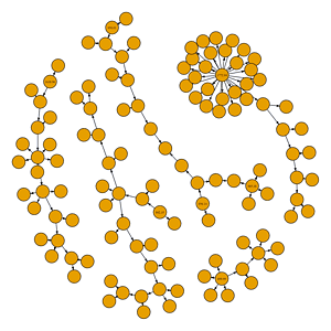
From the plot above we can see that there are 5 components to the graph (isolated sub-graphs), 4 of them have one originating node where we can see the purchase price as a label on the node. One component has 3 originating nodes: this is where records were combined and then sold.
Colours are always nice, so we create a colour palette and get the components and in degrees. In-degree is used to identify the originating nodes, which we will also colour red for visibility.
#create colour palette
ccol <- c(“#C7E701″,”#8FD3FD”,”#BCBDBE”,”#E289EB”,”#F8D27C”)
#get components and in-degree
g <- set_vertex_attr(g, name = “component”, value = components(g)$membership)
g <- set_vertex_attr(g, name = “in_degree”, value = degree(g, mode = “in”))
#original nodes red and colour components
V(g)$color <- ccol[V(g)$component]
V(g)[in_degree < 1]$color <- “red”
#set.seed(1234)
par(mar = c(0, 0, 0, 0))
plot(g, vertex.size = 9,
vertex.label = V(g)$p_price,
vertex.label.cex = 0.4,
vertex.label.color = “black”,
edge.arrow.size = 0.3,
edge.color = “black”,
layout = layout_orig,
frame = FALSE)
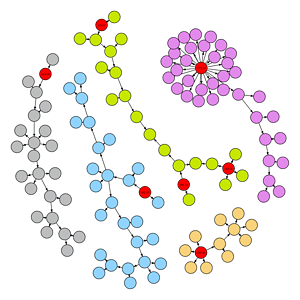
We want the values in the red nodes to spread to the rest of the nodes for each component and, if there are multiple parents, we want a weighted average of the parents’ purchase price. The below function goes through each node and checks if it has a purchase price. If it does not then it identifies the parents of that node, the parent’s purchase price and the weight of the goods in tons. If the node does have parents and the parent purchase prices are not null, then it calculates the weighted average of their prices. Most of the nodes will simply inherit the parent’s purchase price, but note the green component has 3 original nodes, so two of the nodes in that component will need a weighted average.
# Function to propagate attributes
propagate_average_attribute <- function(graph) {
# Iterate over all nodes
for (v in V(graph)) {
# Check if the node has no assigned value but has parents
if (is.na(V(graph)[v]$p_price)) {
parent_nodes <- neighbors(graph, v, mode = “in”)
parent_values <- V(graph)[parent_nodes]$p_price
parent_weights <- V(graph)[parent_nodes]$units
if (length(parent_values) > 0 && !all(is.na(parent_values))) {
# Compute the average of the parent attributes, ignoring NA values
avg_value <- weighted.mean(parent_values, w=parent_weights, na.rm = TRUE)
V(graph)[v]$p_price <- round(avg_value,2)
}
}
}
return(graph)
}
# Apply the function
g1 <- propagate_average_attribute(g)
Plot the graph with node values
par(mar = c(0, 0, 0, 0))
plot(g, vertex.size = 9,
vertex.label = V(g)$p_price,
vertex.label.cex = 0.4,
vertex.label.color = “black”,
edge.arrow.size = 0.3,
edge.color = “black”,
layout = layout_orig,
frame = FALSE)
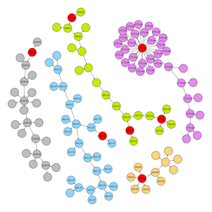
We can see that most of the nodes have been populated with purchase prices, but not all. There are nodes without values, and in addition to missing values, one of the green component’s nodes that is a weighted average is incorrect. It has not taken a weighted average, but rather just inherited the value from one of the parent nodes (which is shown below).
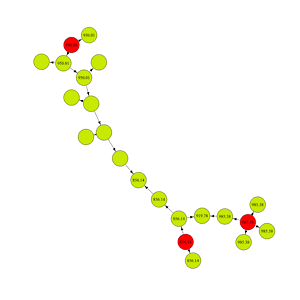
This is happening because of the order in which the nodes are being processed. The function was iterating through nodes based on their record IDs and for most of the nodes that was fine, but the IDs are not strictly in chronological order according to when they were split. In the case of missing values, the blank nodes were processed before the parent node, so the parent node’s purchase price was still null. That means the child nodes could not inherit the parent’s purchase price since it did not yet exist. The same issue is happening in the green component where we do not get the correct weighted average – only one of the parents had a purchase price when the child was being processed.
To solve this problem, we can do a topological sorting of nodes, which is an ordering of the nodes where each node comes before all other nodes to which it has edges. Topological sorting can be performed on directed graphs and ensures that we don’t process any child nodes before their parents.
# Function to propagate attributes
propagate_average_attribute <- function(graph) {
# Get nodes in topological order
topo_orders <- topo_sort(graph, mode = “out”)
# Iterate over all nodes
for (v in topo_orders) {
# Check if the node has no assigned value but has parents
if (is.na(V(graph)[v]$p_price)) {
parent_nodes <- neighbors(graph, v, mode = “in”)
parent_values <- V(graph)[parent_nodes]$p_price
parent_weights <- V(graph)[parent_nodes]$units
if (length(parent_values) > 0 && !all(is.na(parent_values))) {
# Compute the average of the parent attributes, ignoring NA values
avg_value <- weighted.mean(parent_values, w=parent_weights, na.rm = TRUE)
V(graph)[v]$p_price <- round(avg_value,2)
}
}
}
return(graph)
}
# Apply the function
g2 <- propagate_average_attribute(g)
Plot the graph with node values by topological sort
par(mar = c(0, 0, 0, 0))
plot(g, vertex.size = 9,
vertex.label = V(g)$p_price,
vertex.label.cex = 0.4,
vertex.label.color = “black”,
edge.arrow.size = 0.3,
edge.color = “black”,
layout = layout_orig,
frame = FALSE)

Now we have the purchase price and sell price, which lets us know the profitability of each sale. This allows the client to look at the value, amount and time of each transaction to better understand its operations and profitability.
Although this method of analysis got me to the correct information, the ideal solution is better data management, which would reduce the amount of effort to get to the same answers. This could be done by carrying the original record IDs and relevant information to the child records in a relational data design, or alternatively to store the data in a graph structure.
I am really pleased to have had the opportunity to experiment with graph theory in my day-to-day work, but I am sure that there are several alternative ways you could solve this problem. If a more elegant solution comes to mind, feel free to explore the data and share what you come up with, we are always keen to learn.
