Turning data into decisions: Lessons on dashboard development
Turning data into decisions: Lessons on dashboard development
8 June, 2026 •At WASAC, Rwanda’s Water and Sanitation Corporation, data once sat in silos, fragmented, delayed, and difficult to act on. Today, its leadership can track water connection, consumption, revenue, production, and cost in near real-time through an executive dashboard.
This data dashboard was developed as part of the Rwanda Economy Digitalisation (RED) programme. Across the RED programme, Cenfri and its partners have done similar work with a range of Rwandan government institutions and private sector actors.
While these institutions generate or own large volumes of administrative and operational data, the datasets are often fragmented across departments, inconsistently structured, and difficult to use for reporting and planning. As a result, it can be challenging for managers to access timely and reliable indicators to inform decision-making.
In response to requests from partner institutions and sector ministries, we have collaborated in developing 14 dashboards (as at March 2026) to consolidate priority indicators, reduce reliance on manual reporting, and present complex datasets in a user-friendly format.
Cenfri’s approach to developing dashboards
Dashboard development typically involves a combination of technical expertise and close collaboration with partner institutions. Sometimes the technical input has been led by Cenfri and at other times by our associates 71point4 or Analytica MO.
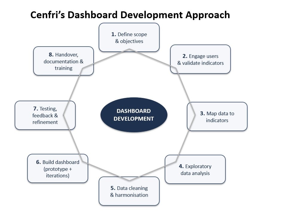
The process typically begins with engaging institutional leadership and technical teams to define monitoring priorities and agree on key indicators. Developing meaningful indicators is a critical step in dashboard development and it requires balancing technical feasibility with decision-making relevance.
Cenfri works closely with partners to ensure that indicators are:
- Relevant: directly linked to policy or operational decisions
- Measurable: based on available and reliable data sources
- Consistent: clearly defined to allow comparison over time
- Actionable: able to trigger specific responses when thresholds are met
In many cases, indicator development involves refining initial requests, simplifying overly complex metrics, and aligning definitions across institutions to ensure consistency and usability.
Available datasets are then mapped to these indicators, and targeted data requests are made. Data protection is an important part of this process, with sensitive information anonymised or hashed where required.
Once data is received, we conduct data quality assessments and extensive cleaning, standardisation and integration to ensure datasets are consistent and usable. Dashboard tools are selected collaboratively, considering institutional preferences, available licenses, and technical requirements. Typically, we have used RShiny, Power BI or Kibana.
Dashboards are then designed iteratively, tested with users, and refined based on feedback. Finally, Cenfri supports training and handover to help institutions embed dashboards into routine reporting and decision-making processes.
Developed dashboards and their impact
The 14 core dashboards develop under the RED programme all share a common goal, that is transforming fragmented data into accessible insights that support monitoring, accountability, and better decision-making.
In agriculture and markets, the Esoko dashboard, developed for the Ministry of Trade and Industry (MINICOM) and the Ministry of Agriculture and Animal Resources (MINAGRI), enables real-time monitoring of retail, wholesale, and farmgate prices, strengthening market oversight. Similarly, the EAX dashboard provides a consolidated view of commodity trades for decision-making, while the cattle insurance dashboard developed for MINAGRI supports real-time monitoring of subsidy schemes.
In education, the School Data Management System (SDMS) dashboard, developed for the Ministry of Education (MINEDUC), improves visibility of key indicators and data quality through an R Shiny interface, while the National Institute of Statistics Rwanda (NISR) survey dashboard enhances public access to survey data, improving transparency.
In the financial sector, dashboards such as a mobile money dashboard developed for the Rwanda Utilities Regulatory Authority (RURA) and eKash and Postillion dashboards developed for RSwitch support oversight of transactions, users, and national trends. The benchmarking statistics dashboard, developed for the AD Finance, further enables monitoring of microfinance institution performance using Superset.
Operational and sector-specific dashboards include the WASAC executive dashboard, which consolidates operational and financial data for timely decision-making, the transport dashboard, developed for RURA, which tracks bus passengers and revenue, and the trillions dashboard developed for the Office of the Prime Minister/Rwanda Development Board for monitoring cabinet-approved interventions. The cooperative dashboard, developed for the Ministry of ICT and Innovation (MINICT), further demonstrates the value of digitalisation in tracking cooperative performance.
Challenges and lessons learnt
Challenges
Developing these dashboards has involved navigating challenges related to data availability, quality, and integration. Some indicators required additional data preparation, and existing datasets often needed cleaning, merging, or restructuring. These tasks were carried out in close collaboration with partner teams. In one project, data from multiple departments and institutions had to be consolidated and securely prepared before it could be used in a dashboard. In another case, only a small sample of data was initially available, which required careful aggregation and integration across multiple sources to produce actionable insights.
Some datasets or systems had limited or no documentation of existing processes, requiring teams to reconstruct analytical logic and work closely with partners to ensure indicators were accurate and meaningful.
Data access and governance required careful management. Cenfri worked with partners to define and prepare data for secure use, including anonymization and encryption. For partners with limited resources, Cenfri sometimes provided dedicated infrastructure to enable secure access, allowing teams to work efficiently while maintaining confidentiality.
Fragmented datasets and legacy files were also a challenge. Missing unique identifiers and undocumented variable definitions often made it difficult to combine datasets into a unified view. In some cases, Cenfri developed synthetic keys or combined variables to create coherent datasets. Engaging directly with data custodians helped clarify inconsistencies and ensure the integrity of the dashboards.
Irregular update schedules added complexity, particularly when partners expected real-time monitoring for all indicators and, in some cases, there was no automated pipeline to update the data regularly.
Dashboard tool preferences also occasionally conflicted with technical requirements. For example, some institutions preferred open-source tools that lacked the level of customisation needed for certain dashboards, requiring careful negotiation and technical guidance. Others preferred tools they were already using, but in some cases, these had expired licenses or were not budgeted for, creating additional challenges.
Lessons learnt
The dashboard development work across the RED programme has provided valuable insights into what works and what is needed to make dashboards usable, and sustainable. Lessons learnt can be grouped into technical, data, institutional, and sustainability categories.
Technical lessons
Starting with exploratory data analysis (EDA) is essential to understanding the availability and quality of data and to define key indicators collaboratively with partners. Developing mock-ups or wireframes before building full dashboards helps align expectations and ensure that institutional teams clearly understand what the dashboards will deliver.
Deploying a minimum viable product (MVP) using rapid-deployment tools such as Superset or Kibana allows early testing of data pipelines and indicators, while providing initial buy-in from stakeholders. Decisions about tools require balancing speed and flexibility. Off-the-shelf solutions offer quick deployment, while custom solutions can provide greater flexibility although at the cost of longer development time.
Iterative testing with users ensures dashboards are functional, intuitive, and aligned with decision-making needs.
Data lessons
High-quality, well-prepared data is central to dashboard success. Standardising identifiers, variable names and units, enables integration across fragmented datasets, while cleaning and harmonising data ensures reliability. Conducting data quality assessments help define trust levels for each indicator, allowing users to interpret results with confidence. Mapping datasets to indicators and aligning multiple sources are crucial steps in creating consistent and actionable information for dashboard visualisations.
Institutional lessons
Dashboards are only useful if they are actively used. Securing senior management buy-in early is critical to ensuring that dashboards inform decision-making. In practice, this was achieved by engaging leadership during the indicator selection phase, translating their key challenges into indicators and involving them in validation.
Early analysis of selected indicators, presented through concise slide decks, as well as the development of initial dashboard prototypes, helped demonstrate how real-time data could support specific operational decisions. These efforts were instrumental in securing early buy-in, fostering ownership, and ensuring continued use of the dashboards.
Establishing clear roles and responsibilities for data provision, maintenance, and usage helps avoid confusion or delays.
Capacity development for institutional staff helps ensure that dashboards are not simply visual tools but become integral to decision-making.
Sustainability lessons
For dashboards to remain useful beyond initial deployment, handover plans must be established, including guidance on updates and maintenance. Training and documentation for institutional staff are critical to enable independent use and continuous improvement.
Dashboards should be modular and adaptable, allowing the addition of new datasets, indicators, or visualisations as institutional priorities change. Continuous feedback loops with users ensure dashboards remain relevant.
Data pipelines are key for pulling data together from various sources. Automation reduces errors, speeds up updates, and ensures that dashboards reflect the most current information, minimising reliance on manual processes.
Conclusion
When thoughtfully designed, backed by reliable data, and embedded within institutional processes, dashboards can act as decision-support systems helping transform fragmented information into actionable insights.
Thanks to Claire Hayworth of 71point4 for input on the lessons learnt about dashboard development.