The joy of mobile survey design
The joy of mobile survey design
11 October, 2017 •I designed a mobile survey today and really enjoyed it. You might be thinking: of course it is satisfying, it is easy. But that really isn’t the case. Mobile surveys, and in this case SMS mobile surveys, require a different approach, and when you’re trained in a more traditional, face-to-face approach, it requires a mind shift.
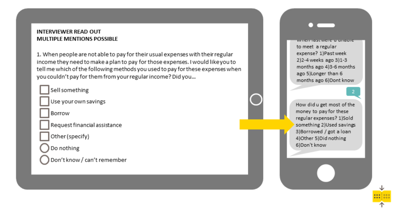
You can’t simply select 12 questions from an existing face-to-face survey and consider your SMS survey done – retrofitting very often does not work within the limitations of an SMS survey.
SMS surveys are useful for reaching the widest possible mobile audience and, as they are run entirely through the short messaging format, they don’t link through to an online platform that is more forgiving of your survey design. SMS surveys need to clearly convey full questions, including answer options, in 160 characters that can be easily understood by the recipients.
Designing a question that is no longer than 160 characters can be challenging, but for me the greatest challenge of designing a mobile survey is keeping the overall questionnaire length concise.

Research and development done by GeoPoll in 2015 found that the optimal length for an SMS survey is 8 to 12 questions, and I’ve experienced that pushing the survey to include more than 20 questions will very likely lead to people giving up and not completing the survey. I’ve completed samples using longer questionnaires, but these generally require greater incentives, including allowing respondents the option of completing the survey in batches staggered over a few days.
While keeping it short is a challenge, it’s also one of the things that makes mobile surveys a powerful tool in the financial inclusion researcher’s toolkit.
The norm for financial inclusion research is lengthy detailed questionnaires with rich, detailed information. I doubt that the SMS methodology will ever sufficiently replace that, but SMS can be used to answer another need – the need for rapid, topical feedback that can be understood and addressed quickly. Through SMS, we could (for example) reach out to refugees in Myanmar, people displaced by earthquakes in Mexico or those affected by the hurricane season of 2017. We could use short SMS surveys to understand the implications of these disasters on financial access and more about the immediate financial needs of people affected.
In addition to reaching people in moments of interest, the cost and time requirements of SMS surveying means that we can reach people more frequently. For example, if we benchmarked the impact of the earthquakes in Mexico now, we could in three or six months reach out again with a short survey to gain insight into the medium-term implications of the earthquakes and then repeat the process after a year. The relative ease of tracking over time the people affected by the 2017 earthquakes can help policymakers, regulators and financial institutions to prepare to better serve people hit by disasters in future.
As a researcher, designing an SMS survey is the beginning of an insights journey that has power through its simplicity. SMS surveys need to focus on a single topic, and this forces me to stick to the essence of the research objective. It makes conceptualising the analytical framework essential to design but also a far more manageable task than developing an analytical framework for a longer, more detailed survey.
Distilling the topic of interest to something that can work in 8 to 12 questions, with few answer options, requires deep thinking about the design, but once you’ve cracked it, the task of writing up an actual survey can be done in less than a day. I find this particularly satisfying because it’s easy to view your survey holistically.
But what is the best part of mobile survey design you may ask? For me, it’s that I will have workable data to analyse in less than two weeks.
Most research providers will be able to assist you in reaching the people you’re interested in surveying using a mobile platform. If you’re interested in how mobile samples are drawn and how different methods perform, look out for my next blog.
Shirley is a researcher within the data team at the insight2impact (i2i) data facility.
insight2impact (i2ifacility) was funded by Bill and Melinda Gates Foundation in partnership with Mastercard Foundation. The programme was established and driven by Cenfri and Finmark Trust.
